Nutrition application - Case study
Definition
1. The problem
- Overeating;
- Consume the wrong foods at the wrong times;
- Overdo the snacks;
- Lack of physical activity;
- Lack of nutrition culture;
- Price of junk food;
- Combination of sedentary activities with food;
- Lack of time to cook and to eat;
- among others.
2. The project
The project comprises creating an application for smartphones, iOS and Android, which offers a solution to the identified problem. In this sense, the “andie – your nutrition coach” application will have various aspects in nutrition: the possibility to consult recipes that are fast and always healthy; the possibility of generating a food plan automatically based on biometric data and specific objectives; the possibility for the user to create a plan for another user, this feature can be used by nutrition professionals to monitor their patients; the ability to create a plan manually based on previously mentioned recipes and the ability to learn about nutrition with a game (andie the game).
3. Target population
The project comprises creating an application for smartphones, iOS and Android, which offers a solution to the identified problem. In this sense, the “andie – your nutrition coach” application will have various aspects in nutrition: the possibility to consult recipes that are fast and always healthy; the possibility of generating a food plan automatically based on biometric data and specific objectives; the possibility for the user to create a plan for another user, this feature can be used by nutrition professionals to monitor their patients; the ability to create a plan manually based on previously mentioned recipes and the ability to learn about nutrition with a game (andie the game).
4. Context of use
The application will be exclusive to iOS (iOS 10 or higher) and Android (android 7.0 or higher) smartphones, it will be mainly used at home as a reference for cooking and eating and secondarily indoors and out to check the meal plan and / or recipes, shopping list and interact with other users.
5. Objectives of this research
On an exploratory phase, this research allowed to understand user habits, expectations and demographic differences related to a nutrition application and at an early stage of development enabled potential failures to be identified and proposed solutions that were addressed prior to the creation of the high fidelity prototype.
After the exploratory phase, while creating the high-fidelity prototype, an usability heuristics assessment took place and helped to correct some issues that were not detected during the exploratory phase, fulfilling the objective of creating a high-fidelity prototype able to sustain an usability test. Finally, the usability test confirmed that the prototype was mature enough to proceed to development. Further usability testing is recommended after an MVP is completed.
6. Methodology
6.1. Sample
The sample is composed of people aged between 30 and 50 years of both sexes.
Participant selection criteria for this study were:
- Age between 30 and 50 years old;
- Being users of an iOS or Android smartphone for a year or longer;
- Education higher than the 9th grade;
- Portuguese as a mother tongue;
- Good visual acuity at close range. Prescription glasses were accepted;
- Often cooking at home;
6.2 Instruments
Several instruments were used in different phases.
In an exploratory phase, a survey with users was carried out through a questionnaire to assess usage habits on websites or applications related to nutrition and cooking, as well as the assessment of users’ functional and aesthetic expectations for a recipe and nutrition application. Through this survey was also possible to perceive demographic inferences.
To perform research on personas, an interview took place to understand users’ needs, experiences, behaviors and goals.
With the information gathered from the first questionnaire and through the personas research, a document with the application requirements was created.
Different Scenarios and hypothesis were created based on the requirements.
From the information collected with the previous instruments it was possible to create a list and perform card sorting sessions to define the information architecture.
With the information architecture defined, a lo-fi ptototype was created and was object of an hierarchical task analysis (HTA) to know details of the process and detect potential for failure on certain flows and features. After the HTA, a cognitive walkthrough (CW) took place and helped to assess usability problems, to make a detailed analysis of potential problems (Jaspers, 2009) and to find solutions afterward.
After the CW an interview took place to obtain relevant information on the reasoning, conceptions and representations of the respondents about the application which helped with the creation of the high-fi prototype, and ultimately an usability test was performed using it.
6.2.1 Questionaire
6.2.1.1 Objective
Assess usage habits on websites or recipe and nutrition applications; assess users’ functional and aesthetic expectations for a recipe and nutrition application, as well as perceive demographic inferences.
Hypothesis: “The choice for cooking based on device recipes is related to usage, characteristics and demographics.”
Help to define design requirements.
The questions chosen for the questionnaire (see table 1), besides their link to the hypothesis, are based on the literature. Researchers (Fu et al., 2013) conducted a study to identify user feedback on applications in the App store. In this study, it was identified that the main reasons users like and want to use an application is directly linked with: attraction (aesthetics); stability; precision, among others. Those mentioned were used for the questionnaire questions.
6.2.1.2 Procedure
A questionnaire was created in Google forms and had 5 sections: user experience; preferred features; visual appearance and content; social interaction and demographic data in a total of 12 mandatory answer questions not paginated, but with a progress indicator. The fill time was approximately 4 minutes.
With Google forms, participants were able to perform the survey remotely on their own equipment which could be a desktop computer, a laptop, but also tablets and smartphones (Schaik , Wong & Teo, 2014) or another device with a modern browser and internet connection. Although the form is Google, no login was required. By not logging in, the participant felt more confident that the questionnaire was really anonymous.
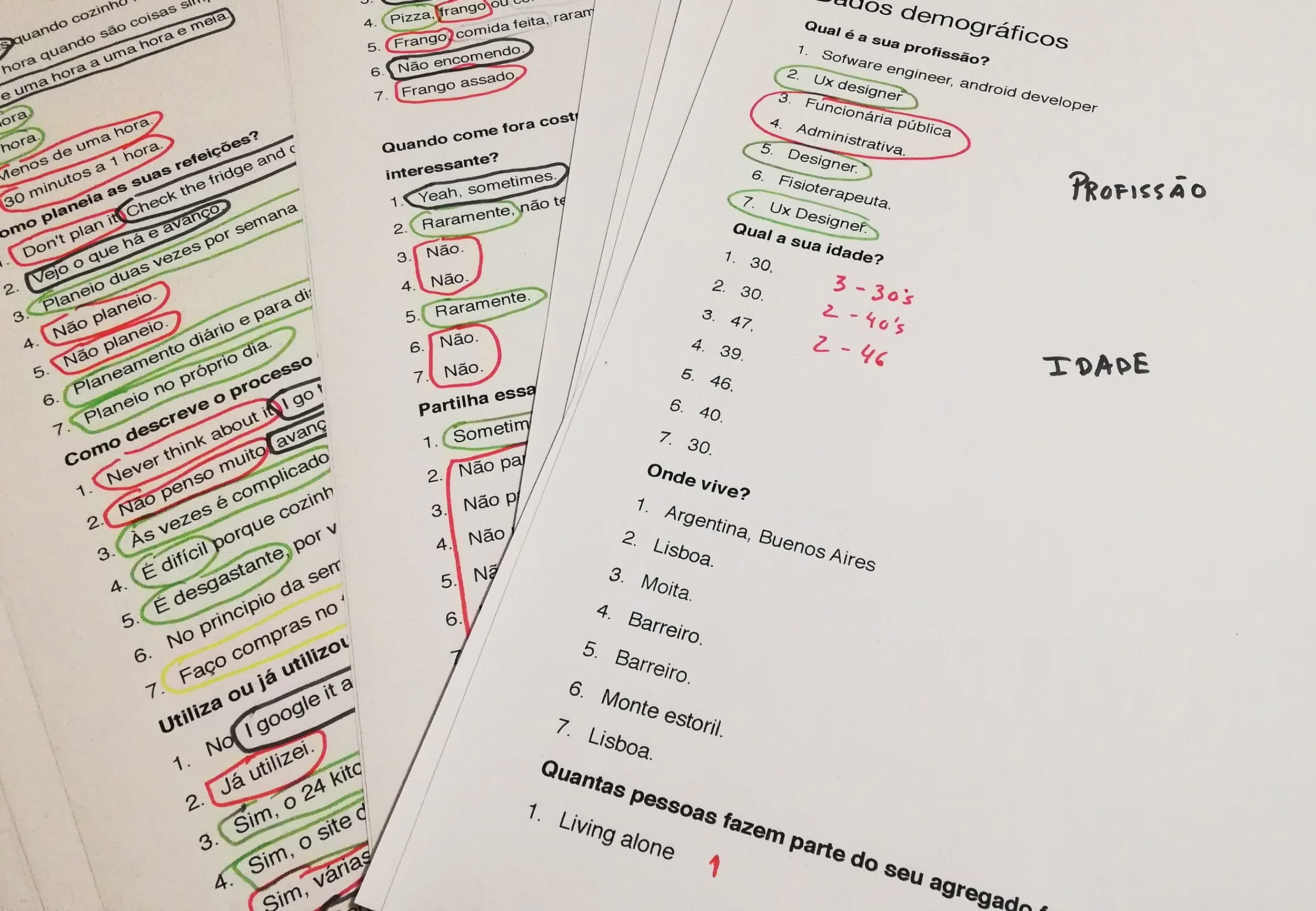
The questionnaire was posted online in 26 and 27 of April 2019. 12 participants, representative of the sample answered. Based on the data collected, changes have been made to the application planning. The initial plan was to focus primarily on the feed plan created specifically for users, but it was found that there is also a strong interest from users to see only recipes without being part of a plan. It is also clear that users dislike to see video-only recipes; they prefer when recipes have a text explanation. 72% of participants in this quiz have 30 minutes to 1 hour to cook, the rest have less than 30 minutes, so it will not be worthwhile to have long recipes. Recipes should be easy to make as 85% of quiz participants want to see simple recipes. With this background data, we can also conclude that the preferred color for the application is green and that social interactions with other users are of medium importance, so they should be merely optional and without major impact on the application. Regarding the choice of green by the participants in the questionnaire, this data was recorded as important and during the research for the high fidelity Design prototype, there was a concern to know more about activation (arousal) and pleasure around the color being curious to find that the Green is among the colors that cause the most pleasure and most activation (Valdez and Mehrabian, 1994).
6.2.2 Interview
6.2.2.1 Objective
Understand users’ needs, experiences, behaviors and goals.
6.2.2.2 Procedure
A qualitative method by conducting a semi-directive script-based interview, done indirectly through Google hangouts and WhatsApp video.
After the interviews were recorded, a content analysis was done to find patterns that allowed to differentiate 3 distinct users. See Figure 1.
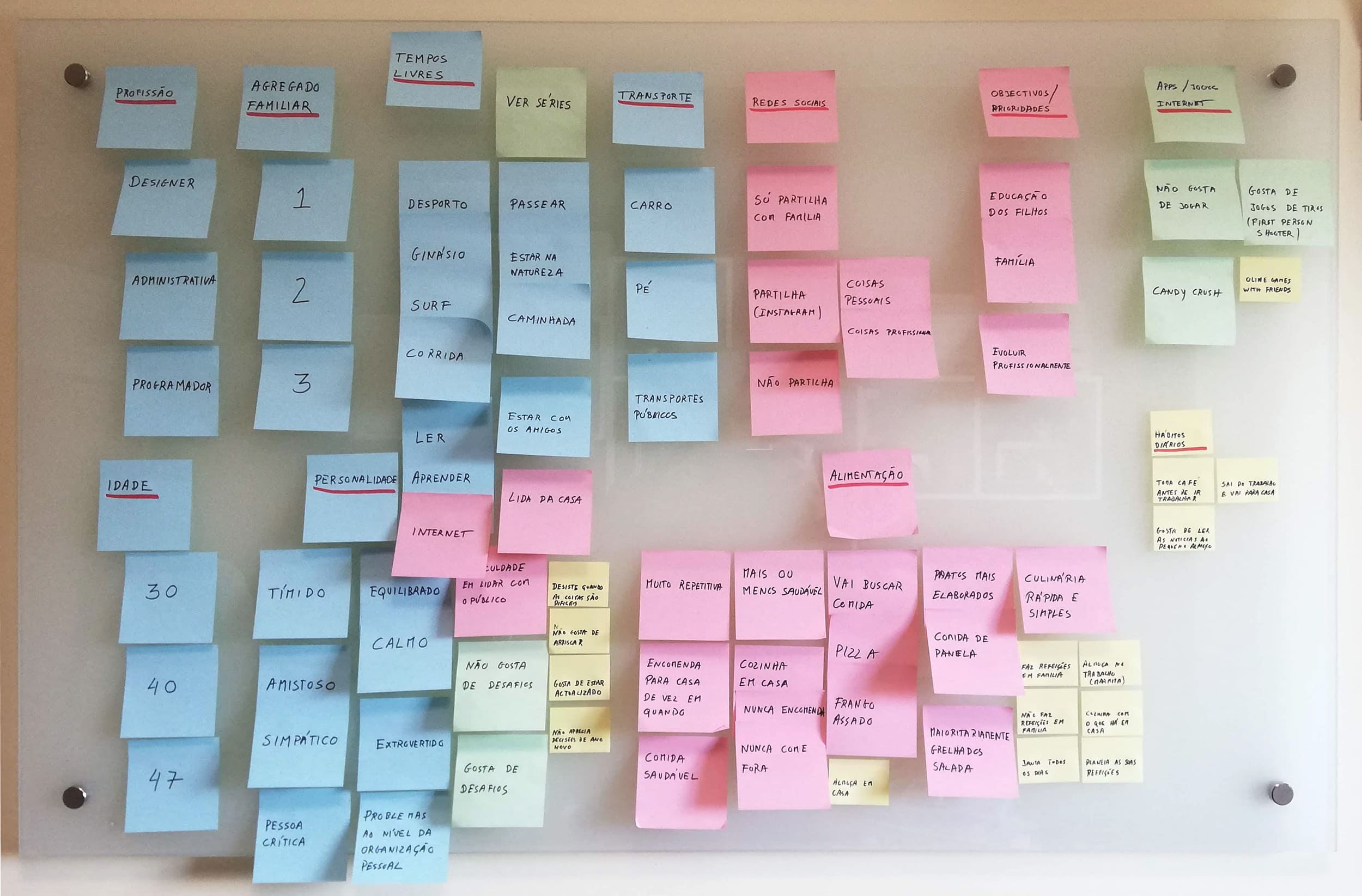
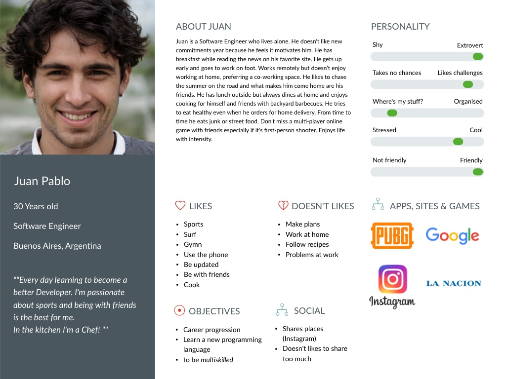
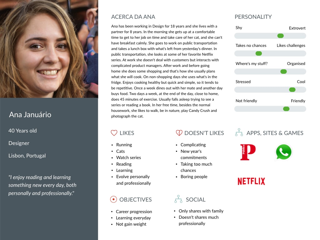
After content analysis, and based on these data, an affinity map was assembled (see Figures 2 and 3), which allowed to find the personas, see Figures 4 to 6. For the personas images thispersondoesnotexist.com which generates images of person who do not exist through Style-based GANs – Generating and Tuning Realistic Artificial Faces. By using this platform, it was ensured that real person’s images to illustrate personas were not used.


6.2.3 Application requirements
6.2.3.1 Design requirements
After analyzing these data it was possible to characterize the application requirements.
The application should:
- According to the user’s goals / needs automatically suggest 4 solutions for each meal of the day. For each solution, if applicable, a recipe must be presented;
- Allow another user to act as a coach and suggest meals to other users;
Allow to browse the recipe database and choose one for cooking; - Each recipe should always contain the text with cooking instructions and always be illustrated with video or image;
- The recipes presented must indicate the cooking time and can be filtered in the search by cooking time;
- Most recipes should be quick to cook (30 minutes to 1 hour);
- Calculates calories per meal and warns if the user is exceeding the recommended daily maximum;
- Make a shopping list based on recipe ingredients and / or meal plan products;
- Contain a game to teach users about food;
Allows you to record progress in terms of weight; - For weight progress logging lets you communicate with other applications to get data;
- Has user rank (points), coach rank (points) and badges (user challenges and coach challenge);
6.2.3.2 User requirements
- 30-50 year old
- Smartphone users for over 1 year
- Able to interact with smartphone apps
People who cook frequently
6.2.3.3 Context of use requirements
The application will be mainly used at home as a reference for cooking meals.
Secondarily at home and out to browse, interact with other users and check the shopping list.
6.2.3.4 Hardware requirements
IOS or Android devices that support the following systems:
- iOS 10 or higher
- Android 7 or higher
Linux server for database and application support code storage.
6.2.3.5 Visual language requirements
Modern, clean and simple design with formal characteristics.
User preferred color for a nutrition and recipe app (collected in the questionnaire): Green (primary); Secondary Colors (Yellow, Orange)
The first time the user opens the application, a series of three screens with the specific purpose of motivating the user to use it will be presented. This series of screens represents the user’s first contact with the product and it is at this point that it is intended to foster a moment of hedonic identification – high positive valence (pleasure), Norman’s moment of visceral beauty, which according to the author is of immediate response. In 2006 an article was published titled “Attention web designers: You have 50 milliseconds to make a good first impression!” ; According to this study, the data collected suggest that a reliable decision can be made in 50 milliseconds and it’s in that short time that a website makes a good or bad impression. The data from the same study also suggest that the notion of visual appeal may be closely linked with other concepts regarding general impressions of layout, color, etc. (Lindgaard et al., 2006). Although the study was conducted for websites, the same principle may apply to mobile applications as the result of one study suggests that the judgment of people for a mobile application is the same as for widescreen GUI websites, namely, quickly and reliably (Miniukovich & De Angeli, 2014).
6.2.3.6 Language requirements
According to the target age range – Formal / casual.
6.2.3.7 User data requirements
To start using the application the user can simply sign in with Google, Facebook or Twitter account.
To access features such as objective-based recipe suggestions the user must complete his profile with:
- Age
- Weight
- Height
- Objective (Lose weight; gain muscle; maintain weight; gain weight)
- Food Allergies
- Medical Conditions (Diabetes; Celiac Disease; Obesity, etc.)
The user will be able to choose what is seen on their profile.
Once the daily meals plan is defined it should be possible to consult offline.
6.2.3.8 Interaction requirements
Touch, swipe, shake (to clear forms).
6.2.3.9 Usability requirements
The recipes should be quick to prepare.
Having video and image to illustrate the recipes provides better instructions, however, it is important to users, through feedback from the questionnaire, that all recipes have text instructions.
A task should take no more than 3 taps to start.
Normal application views should take no more than 2 seconds to load (Shneiderman, 1984)
Database searches that may take longer than 2 seconds will have to display a loader (Li & Chen, 2019)
The game (andie) when loading should show a progress bar (Myers, 1985).
The permissible errors in terms of heuristic evaluation are number 2 on the severity scale – Minor usability problem (Nielsen, 2007).
Satisfaction level will be measured by entering a contact in the app where users can report problems. Through store feedback it is also possible to measure user satisfaction.
6.2.4 Scenarios
6.2.4.1 Objective
Gather information to complete the findings collected in the app requirements. This information will be used for card sorting.
6.2.4.2 Procedure
Create different scenarios of interaction to help complete the information gathered on the application requirements and define the main navigation with all possible sublevels.
6.2.4.3 Scenario 1
Rita has a family of 3. When she gets home on Tuesday after a day of work she has to cook dinner and she only has 45 minutes to do it.
In what ways can Rita use the “andie” application to accomplish this task?
Hypothesis 1
She took some time off Saturday night, consulted the recipe suggestions “andie” made, and chose the ones she wanted to cook for each day of the week. She added the missing ingredients to a shopping list and purchased them on Sunday. Every day she knows exactly what she’s going to cook. She chooses the recipe from Tuesday and starts cooking.
Hypothesis 2
She had realised that she had a suggestion from a friend for that day, passed by the supermarket, bought the ingredients and when she gets home, she cooks the recipe.
Hypothesis 3
In the morning while drinking coffee she chose a recipe for dinner, added the missing ingredients to the shopping list. She passed by the supermarket before arriving home and bought them. When she gets home, she cooks the recipe.
Hypothesis 4
Arrives home with no plans for dinner. Opens the application and enters ingredients she has available and gets recipe suggestions based on them.
Hypothesis 5
She gets home without any plans for dinner, chooses a recipe with ingredients she knows she has and cooks.
6.2.4.4 Scenario 2
Hypothesis 1
Peter is a nutritionist has an obese friend who can’t make proper food choices for his problem. His friend already has the application installed and Peter knows his user, so he offers to help make healthy choices for his friend. When trying to help a friend, Peter gets points.
Peter enters the application, selects recipes, and adds them to his friend’s weekdays.
His friend receives a notification in the app’s message area, sees Peter’s suggestions and after approving them, they are added to his weekly meal plan. When rejecting, a reason for rejection can be added, the notification disappears and Peter is notified that the recipe has been rejected.
Hypothesis 2
Peter’s friend completes his profile, enters his weight data and his goal. Then chooses to have the automatic weekly plan and the plan is created.
6.2.5 Card sorting
6.2.5.1 Objective
To create the information architecture.
6.2.5.2 Procedure
The instruments used for data collection were:
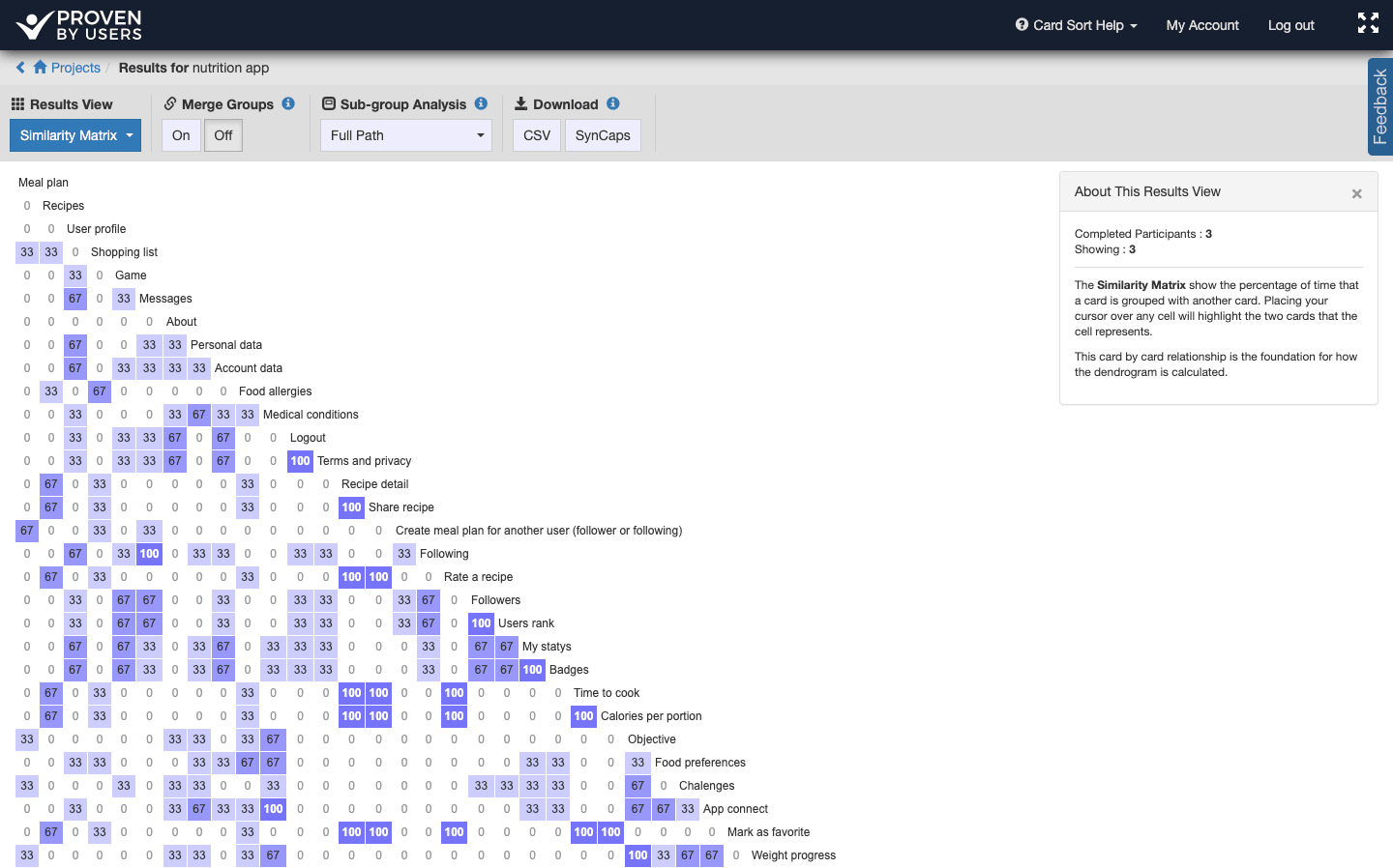
Live online card sortings through Slack video, performed on the provbyusers.com website. The “Proven by users” tool compared to others allowed participants greater flexibility in creating categories and subcategories to organize information. Slack allowed to draw on the interface remotely to explain how to perform the card sorting correctly, see Figure 7.
Card sorting in person.

6.2.5.3 protocol
The online card sorting was held May 1, 2019, live with 4 participants and recorded on video for further analysis, see figure 8.
The face-to-face card sorting was performed on May 1, 2019 using post-its.
The items sorted were taken from the “Design Requirements” referred to in 6.1 and from the different scenarios created. A table with all items to be sorted and a brief description of each one of them was created in Portuguese and English, as three of the participants of the online card sorting were foreigners (2 citizens from Argentina and 1 from India).


6.2.5.4 Card sorting results
After the online card sorting, it was curious to analyze the similarity matrix produced by the “Proven by users” tool. In Figure 10, we can see that some items had a 100% agreement between participants.
6.2.6 Low-fidelity prototype
After the information architecture was completed, the low fidelity prototype using Sketch and Invision was created (see figure 11).

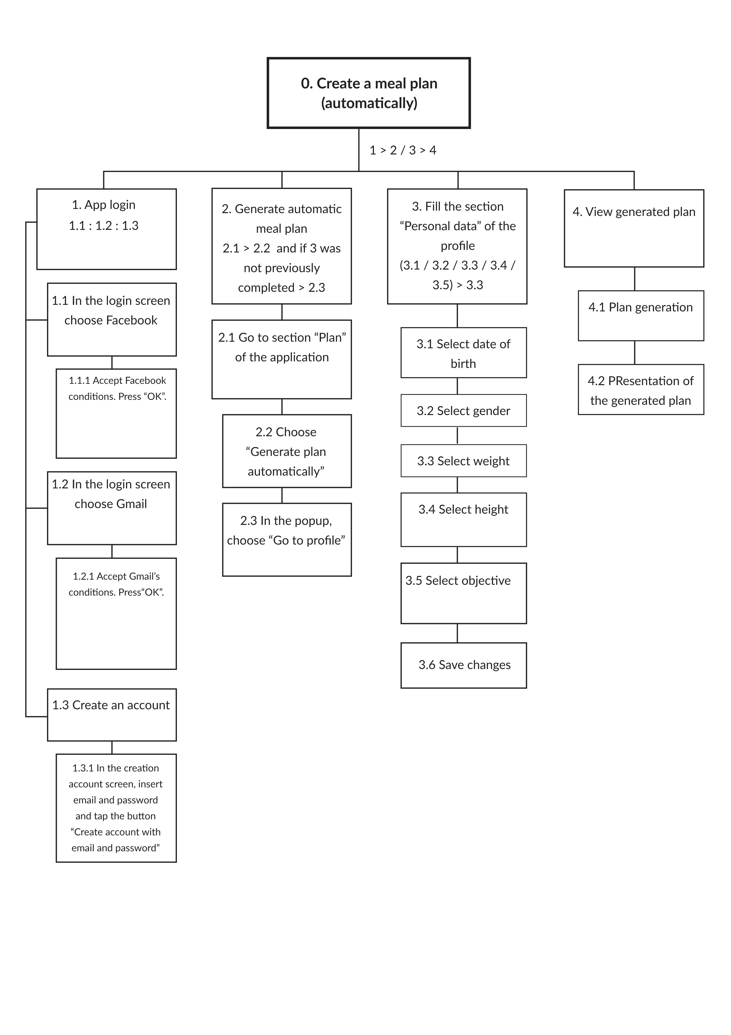
6.2.7 Hierarchical task analysis
The hierarchical task analysis, (see Figure-12) as a method of analysis, allows to know details of the process and detect potential for failure on certain flows and features.
In our specific case it will allow us to perceive potentials of failure in an interaction flow with the application prototype.
The ultimate goal will be to make adjustments to the interaction, views, inputs or feedback that are given to the user, improving the interaction of what is the main functionality of the product, namely, the creation of a food plan adapted to the users objectives.
Application users who matched the sample of this study performed the task.
Being able to complete this task is of great importance to the product as it is the core functionality of the application, so it is intended that the task be completed successfully in its entirety.
The major source of information will be expert opinion (Ux designer, engineers and other stakeholders)
Another source of information will be the observation of a user interacting with the prototype.
The analysis plan will be based on decision procedures, ie there will be a sequence in which the user has to make decisions whose action depends on specific inputs.
6.2.8 Cognitive walkthrough
The Cognitive Walkthrough (CW), following a hierarchical task analysis model (see Figure 12) has allowed to assess usability problems, to make a detailed analysis of potential problems (Jaspers, 2009) and to find solutions afterward.
6.2.8.1 Procedure
The Cognitive Walkthrough was face-to-face, held in a meeting room of a coworking space set in a quiet, riverside area away from noise and disturbance. The room is a very cozy room with good soundproofing and the chairs are very comfortable. The atmosphere was informal and relaxed. The equipment used was an Android device (Huawei Mate 10 lite) with the low-fidelity prototype of “andie – your nutritional coach” installed via Invision.
In the equipment was also installed the application “AZ screen recorder” that allowed to record sound and video of the interaction which took approximately 5 minutes.
It was conducted with 5 participants, from 27 to 29 May 2019. A table with all interactions results was created. No task grading has been assigned (Bligård & Osvalder, 2013) since all tasks are grade 1, meaning that the goal is not achieved without all being completed.
Two of the users stated that the app was confusing after logging in on the “Recipes” tab, a welcome screen with two main choices was recommended “Create a meal plan” and “view recipes”. This screen was later implemented in the high fidelity prototype. One of the users failed to find the “plan” because he did not understand where he was.
6.2.9 Interview
6.2.9.1 Objective
The overall goal is to assess the user experience in performing a task using a low fidelity prototype of the application.
As specific objectives it will help to understand more directly the opinion about the prototype and how the user mentally represents the application.
The type of data collected is intended to obtain relevant information on the reasoning, conceptions and representations of the respondents about a project, program or product.
6.2.9.2 Procedure
The interview was in person, under the conditions referred to in 6.2.8.1.
It was a semi-directive interview, which took place after the cognitive walkthrough. Although the questions were pre-established, during the interview, within the subject, users were able to freely express their thoughts and opinions. Neutral requests for further information were made when it was felt that the interviewees had not fully expressed their thoughts.
The interview lasted approximately 20 minutes and was recorded using an Android mobile device (Huawei Mate 10 lite) and the “Audio recorder” application.
6.2.10 High fidelity prototype
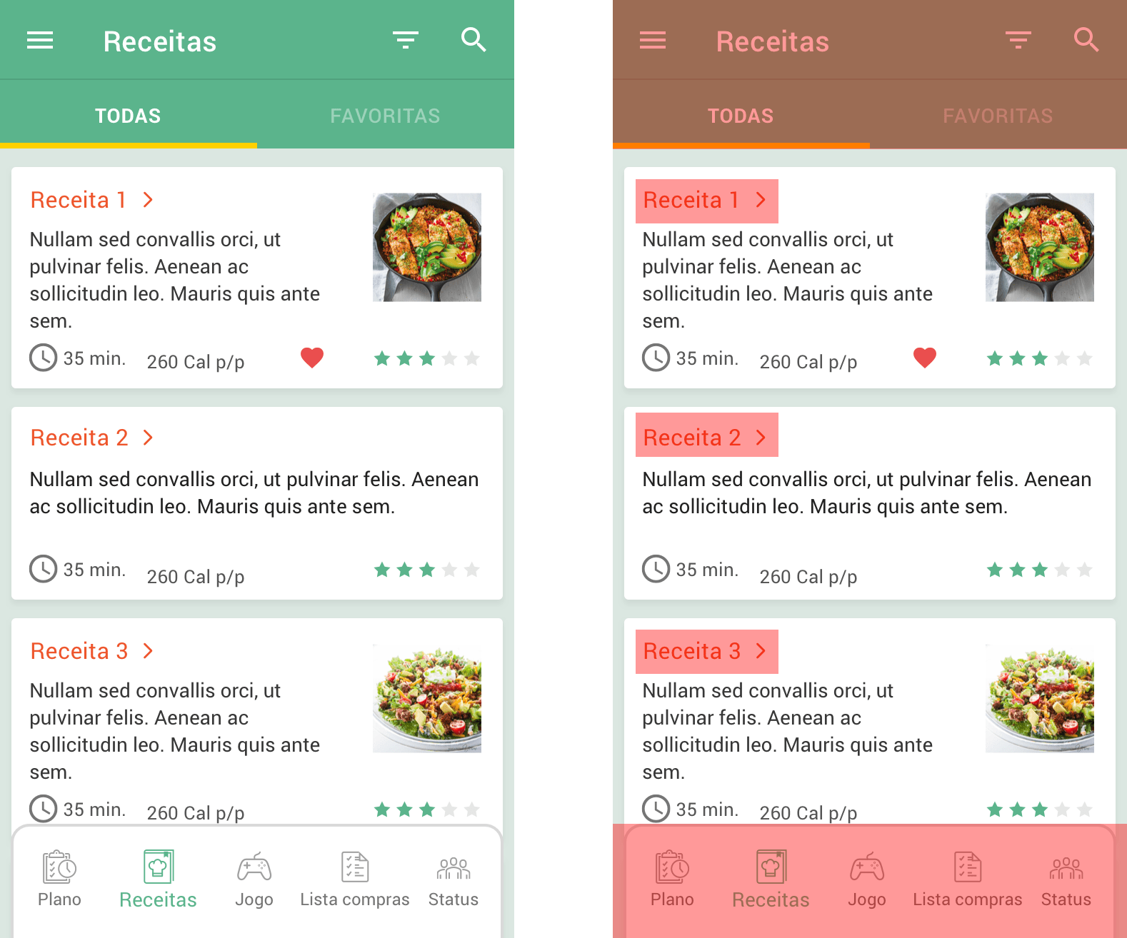
The cognitive walkthrough has identified some issues that have been resolved in high fidelity prototyping. The prototype was created using Sketch and Invision (see Figure 13) which together made it possible to interact with it on the phone in a full screen view.

6.2.11 Usability heuristics
The design process took into account the usability heuristics pointed out on ISO / DIS 14915-1, and the high fidelity prototype sought to respond accordingly. In the following items, we will check how they were fulfilled.
6.2.11.1 Visual consistency
6.2.11.1.1 A hierarchy is identified

6.2.11.1.2 Navigation options are identified
6.2.11.1.3 Color schema harmony
 The colors responded to the visual language requirements referred to in 6.2.3.5, and were not chosen just because users requested it, but because they were confirmed by the literature already mentioned, also, the existing complementarity does indeed give a good contrast. The colors used also have their own area, their own space, guaranteed by the use of white that allows them to be autonomous and achieve the desired harmony.
6.2.11.1.4 There is a balance of elements on the screen (graphics and visual rest zones)
 Although this screen differs from the previous screen, we can observe that there is a visual consistency that is maintained not only by the heuristics mentioned above but also by the use of graphic spaces. The space between the elements and the use of white provide areas of visual rest and therefore a good balance of the elements.
6.2.11.1.5 Graphic consistency
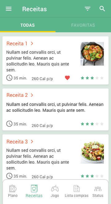
A particular care has been taken to keep the icons within a visual family, and the photographs used follow a pattern of square-shaped photographs in the listings and rectangular-shaped photographs in the details as shown in 6.2.11.1.4.
6.2.11.2 Functional consistency
The application header is always green, which coincides with the primary navigation icon that is selected, trying to make a clear link between both elements.
Text links are always in orange, as are existing call to action buttons. Thus, color is associated with specific subjects.
In navigation it was important to associate the icon with the subject under consultation, thus seeking the use of images associated with the subject of the interface.
6.2.11.3 Internal consistency
Functional areas are always in the same location and the font style is always kept in the same family, with Semibold annotations to highlight elements.
6.2.11.4 External consistency
Conventions were maintained through the use of native elements from development frameworks (iOS and Android).
The icons of primary navigation guaranteed the analogies with the real world.
6.2.11.5 Efficiency
6.2.11.5.1 Navigation
Who created this software?
This question is answered in the “more” information section accessed by the top menu.
In this section, there is an item called “About the app”.
When was it last used?
Not shown as it was not considered relevant.
Where am I?
This information is given in the top bar that always has the view title.
What are the main sections?
Main sections are given by the primary navigation (bottom navigation).
How can I search for information?
In views where it’s possible to search there is a magnifying glass icon.
6.2.11.6 Modals
Modals exist whenever a clarification of a particular action is needed and use names consistent with the actions, as seen in the figure below.

6.2.11.7 Aesthetics and Design Minimization

The color scheme is quite simple. It comprises one main color and one secondary color for the links. The three accessory colors are used occasionally in some elements. For the text, there are two different shades of gray scale to further define importance. The main and secondary colors (green and orange) are mainly intended to draw attention to important information.

The most important elements are highlighted through the use of negative space.
One problem identified by users when testing with the low fidelity prototype was that the navigation was too small and too low, making it difficult to tap. Navigation height has been increased making it different from the native look of the platform but increasing its usability.
The sans serif font is best suited to display on information systems and has therefore been adopted.
6.2.11.8 Easy error recovery

Mistakes and successes are indicated in context through clear language. Here, the user is prevented from having to use the keyboard again to complete the email.
6.2.12 Usability test
6.2.12.1 Objectives
The aim is a qualitative behavioral test related to user interaction with the application’s high fidelity prototype in the accomplishment of tasks proposed by a test guide. It is intended to evaluate the product in the prototype phase and answer the following questions:
Can the user log in to the app?
Can you enter a recipe and mark it as a favorite?
Can you add and remove ingredients to an in-app shopping list?
Can you create an automatic feed plan?
6.2.12.2 Sample
The sample is the same as that mentioned in point 6.1 of this page, and 5 users, being part of the sample, used the application through activities defined by a script.
6.2.12.3 The protocol
Two of the tests were performed in person, and three tests were performed remotely. In the face-to-face case, the prototype was presented to users installed on a Huawei Mate 10 Lite Android phone, with the prototype app and AZ screen Recorder applications installed. The interaction was recorded with that application. In the remote case, test users were provided with a link to the app’s high fidelity prototype and asked to record the interaction.
The prototype had no hits about tap areas.
Users should access the prototype on their mobile devices and follow this guide:
1 – Login to the application.
2 – Open recipe 1.
3 – Mark recipe 1 as a favorite.
4 – Select all recipe ingredients and add to the shopping list.
6 – Create a feeding plan automatically.
7 – Logout the app.
6.2.12.4 Results
As seen from the table, users had no problems performing the tasks proposed by the test script and all succeeded.

7. Conclusions
User Experience aims to solve problems in real people’s lives, helping them to achieve their goals. This is one benefit, the one on the user side, but there are several other benefits on the development company side, like cutting down development costs, increasing revenue by being the preferred app against others, or even keeping the company from wasting resources.
The research presented through this case study is time-consuming but it is an investment that prevents money leaks in other departments.
The findings achieved through this extensive research helped to craft a very detailed and effective prototype that would kick off development in a very lean and effective way.


