Portfolio of Luis Alves, UI/UX Designer from Portugal.
Wrong featured link at Grémio Literário
1. The problem
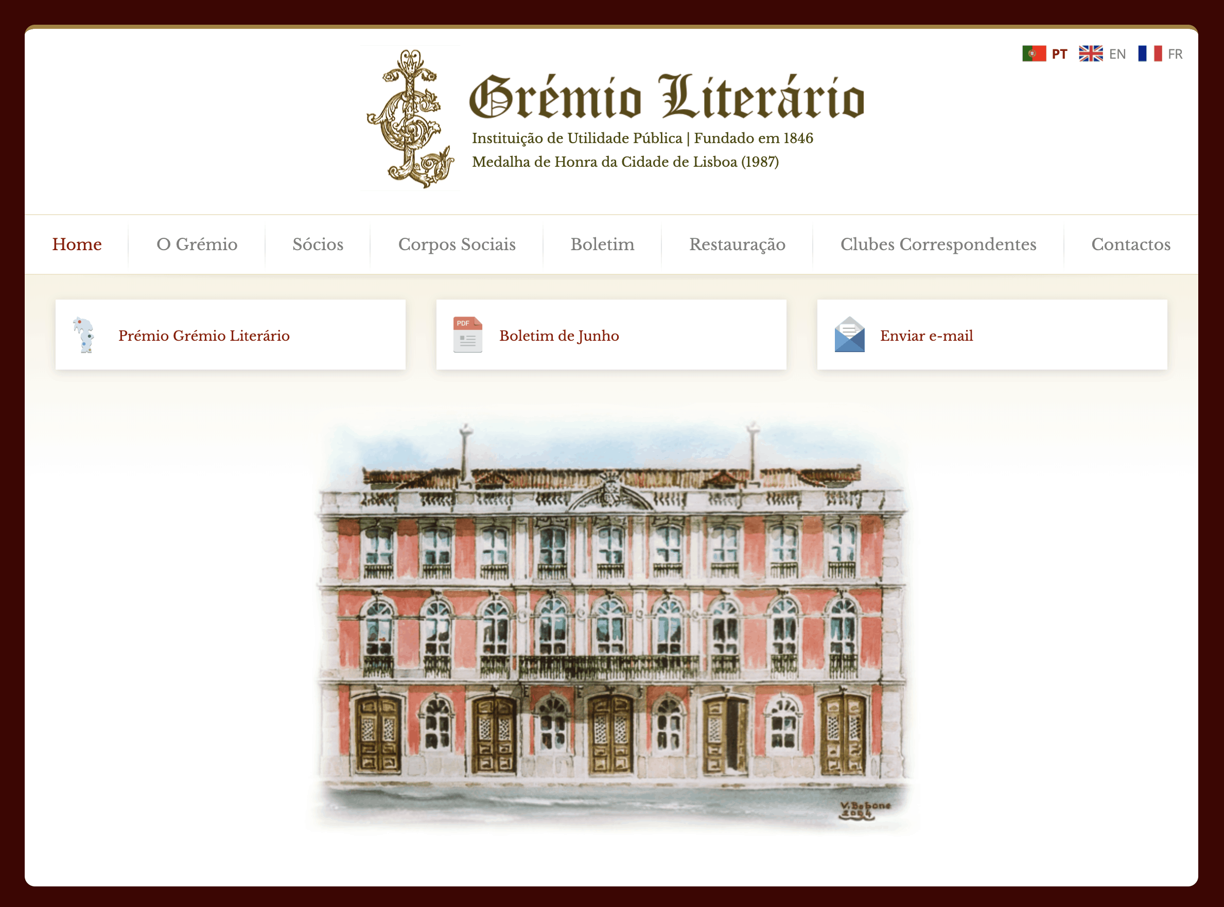
One of the main objectives of the Grémio Literário website is to showcase the monthly activities of the Club through a bulletin.
According to the web management team at Grémio Literário, the preferred way to show the bulletin was in the form of a Web Page and the second way, a PDF document that could be visualised and downloaded, however the client asked to place a featured link in the homepage to the PDF file of the bulletin.
The client was warned that due to the prominence of the featured link, this could be the preferred way for users to view the bulletin, making the main navigation link for the bulletin html webpage, the secondary way of doing so, thus creating a useless webpage. This client was paying for a monthly update of the bulletin webpage, in the case, a page with very low number of visits.
Fig. 1 - Homepage before the UX intervention
Challenge #1 - To show the client that the bulletin is not being seen in the way they named as preferred.
2. The research
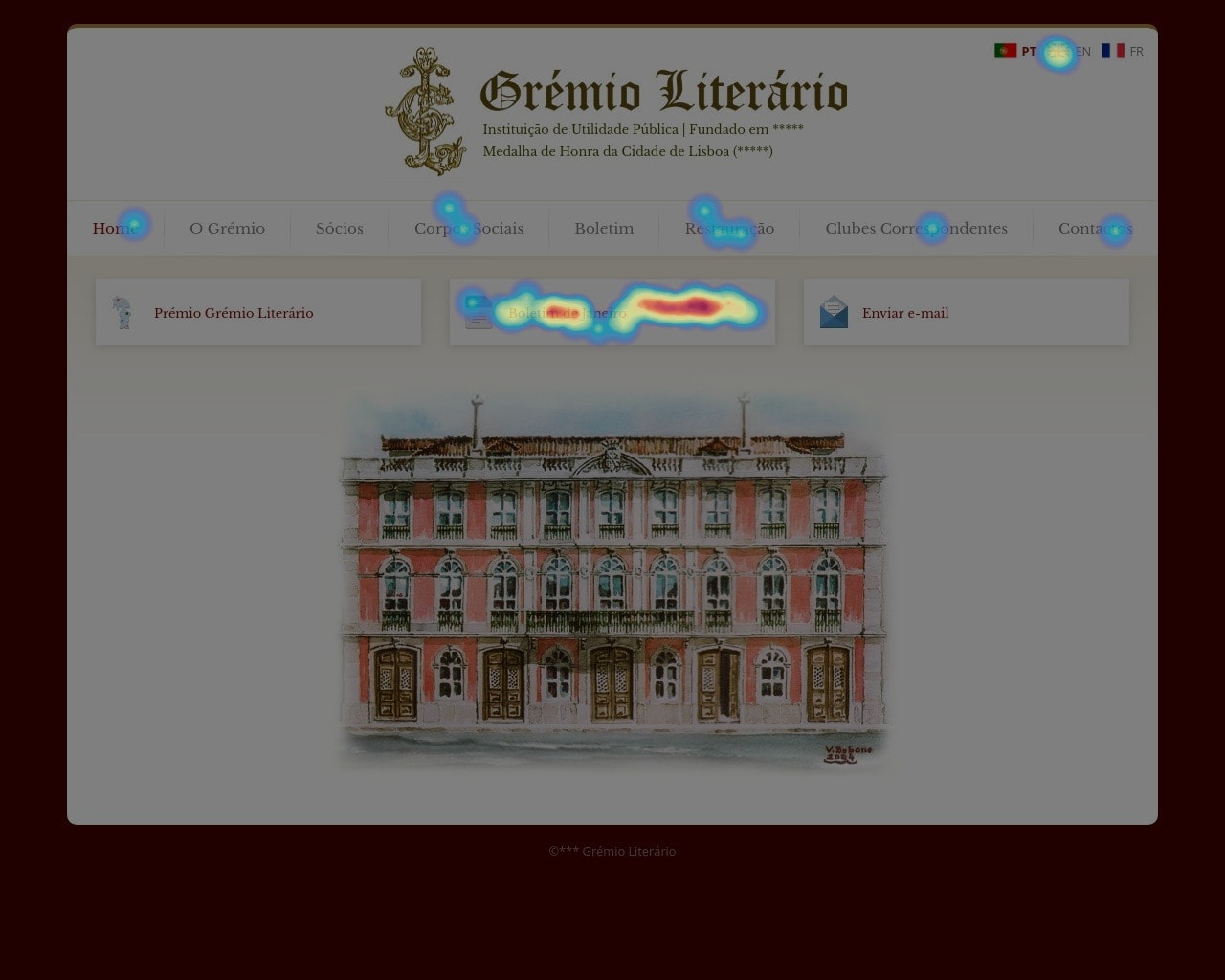
The hotjar tracking code was added to the website and after tracking 2 days of use it was possible to obtain a heatmap that clearly showed the main navigation link to the webpage of the bulletin was being ignored and that the primary and almost unique way to visualise the bulletin was the PDF, through the featured link at the center of the page.
Fig. 2 - Heatmap click shows that the main navigation link for the Bulletin is being ignored. Users were using the featured link to the PDF.
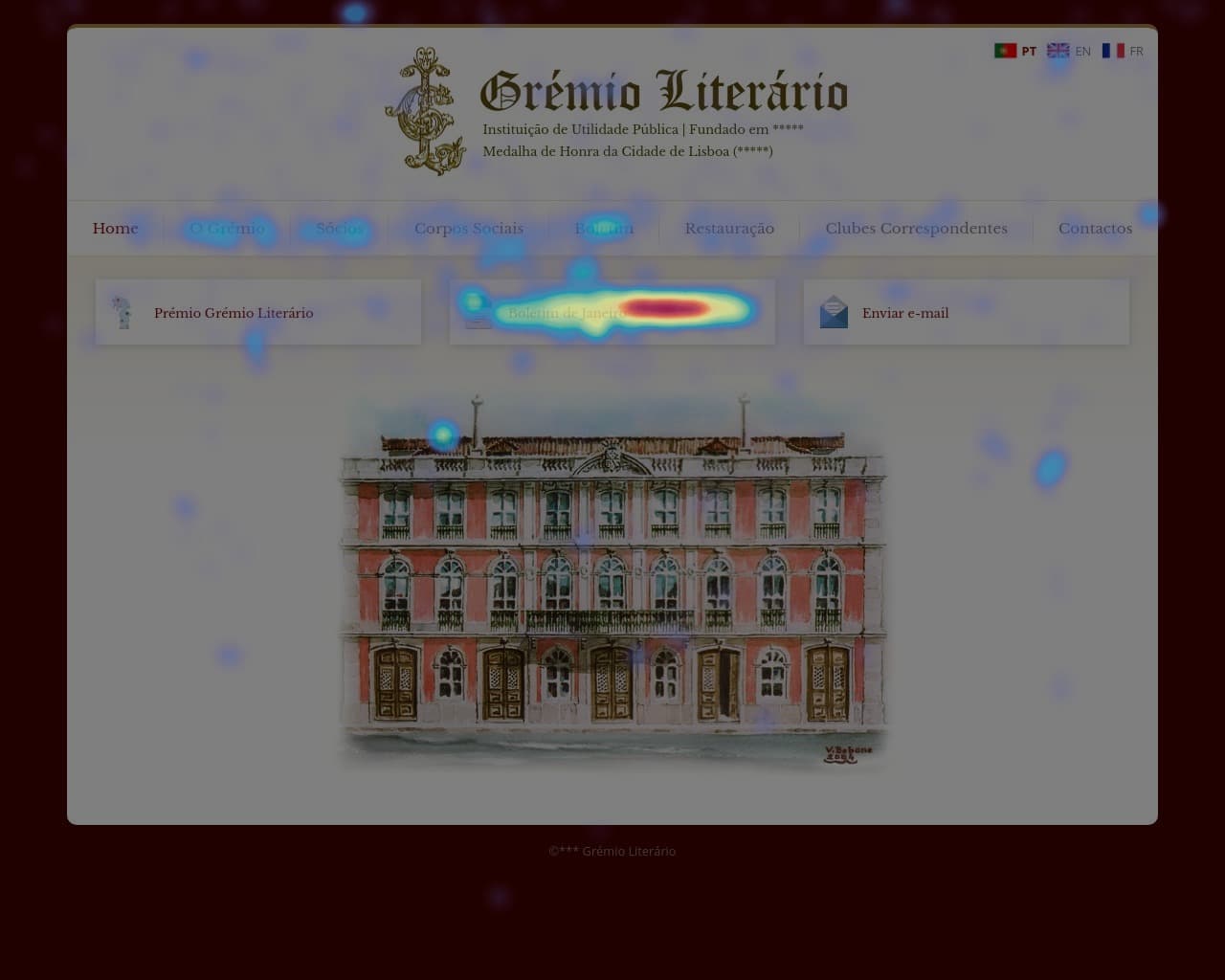
Fig. 3 - Heatmap for movement also shows the prominence of the featured link to the PDF version of the Bulletin.
The difference of clicks between the featured link to the Bulletin PDF and the the main navigation link was massive, thirty clicks against zero clicks.
Another of the research findings was that the users were trying to click the whole card area instead of clicking the text to activate the link.
Fig. 4 - The link area was circumscribed to the text and users were clicking the whole card.
Challenge #2 - Feature the bulletin webpage while maintaining a PDF version to download.
Challenge #3 - Expand the click area to the whole card.
3. The solution
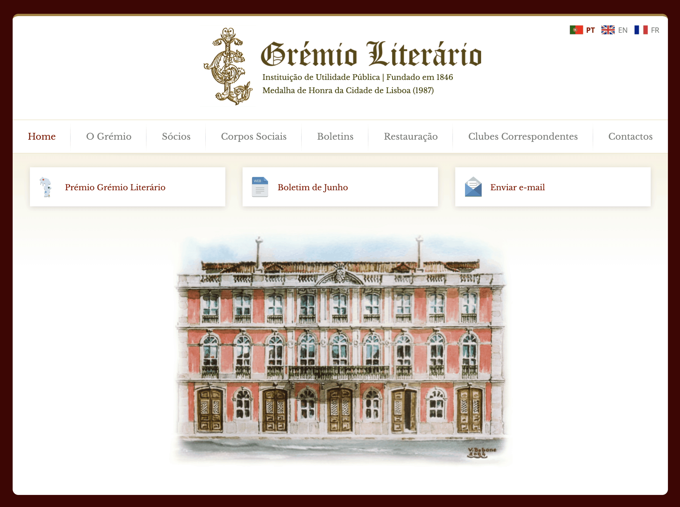
At this stage, after the page being online for a few months, removing the featured link would leave the regular users lost and could cause frustration, so the solution was to use the featured link to go to the webpage of the Bulletin.The featured link icon changed from PDF to Web.
The click area of the featured items was expanded to the whole card.
Fig. 5 - The click area of the featured items was expanded to the whole card.
In the bulletin webpage, a link to the downloadable PDF version was placed.
4. Conclusion
Although this seems pretty straightforward, the team at Grémio believed that the users would understand that the featured link was for the PDF and that they would still want to see the webpage through the main navigation link. This is where research takes place and moves the client into a new direction based on evidence.