Intro to this project
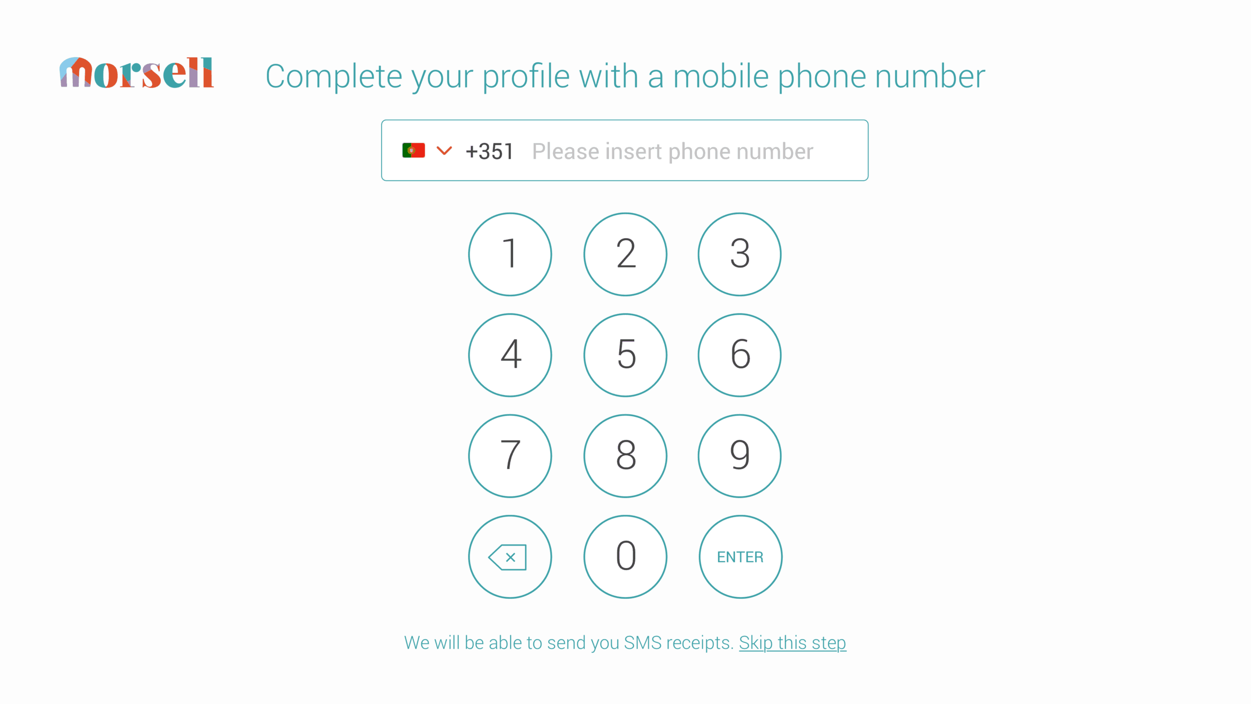
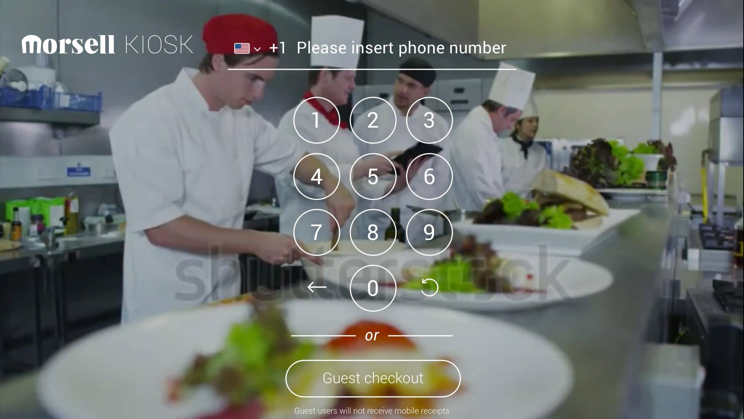
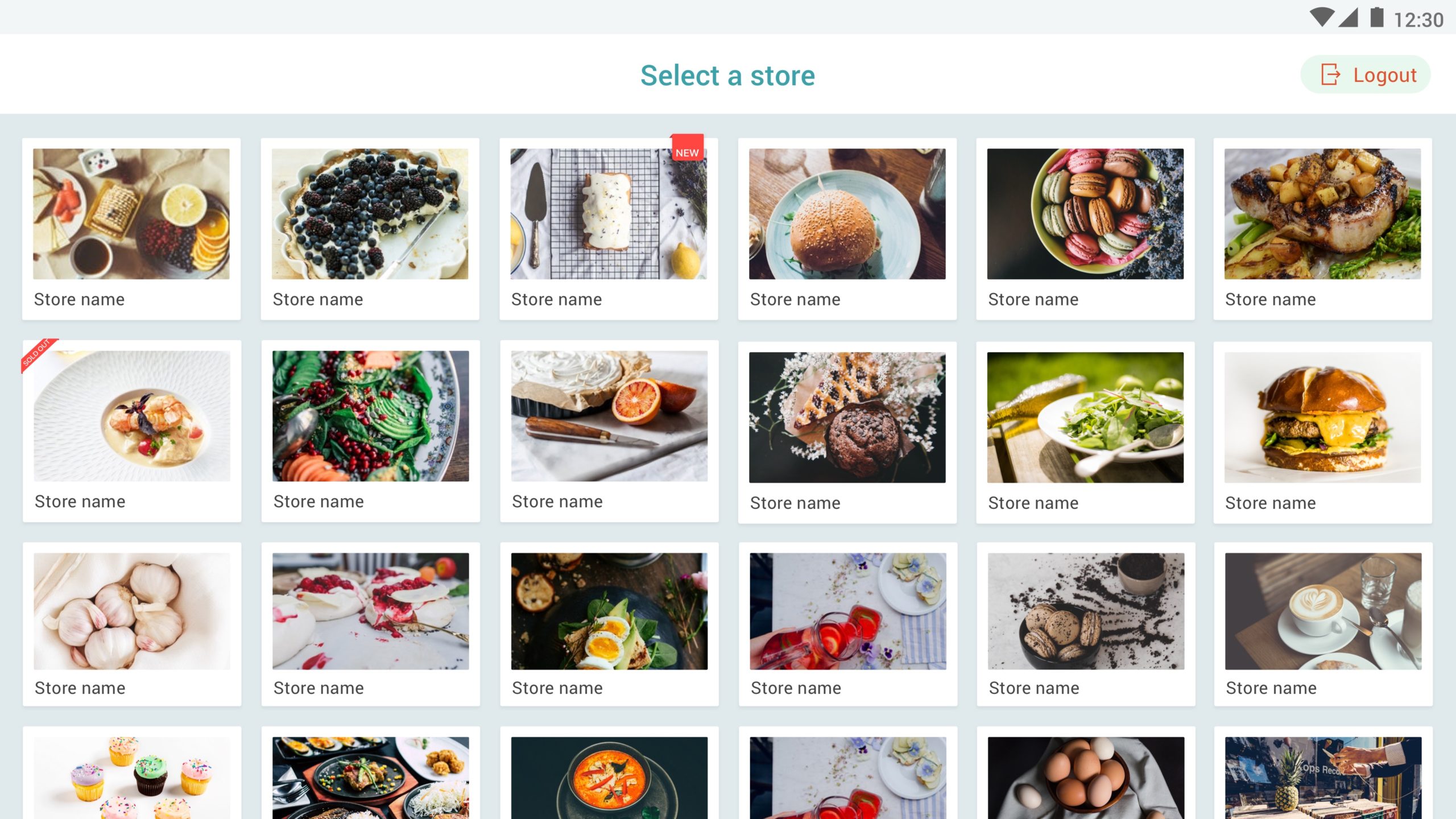
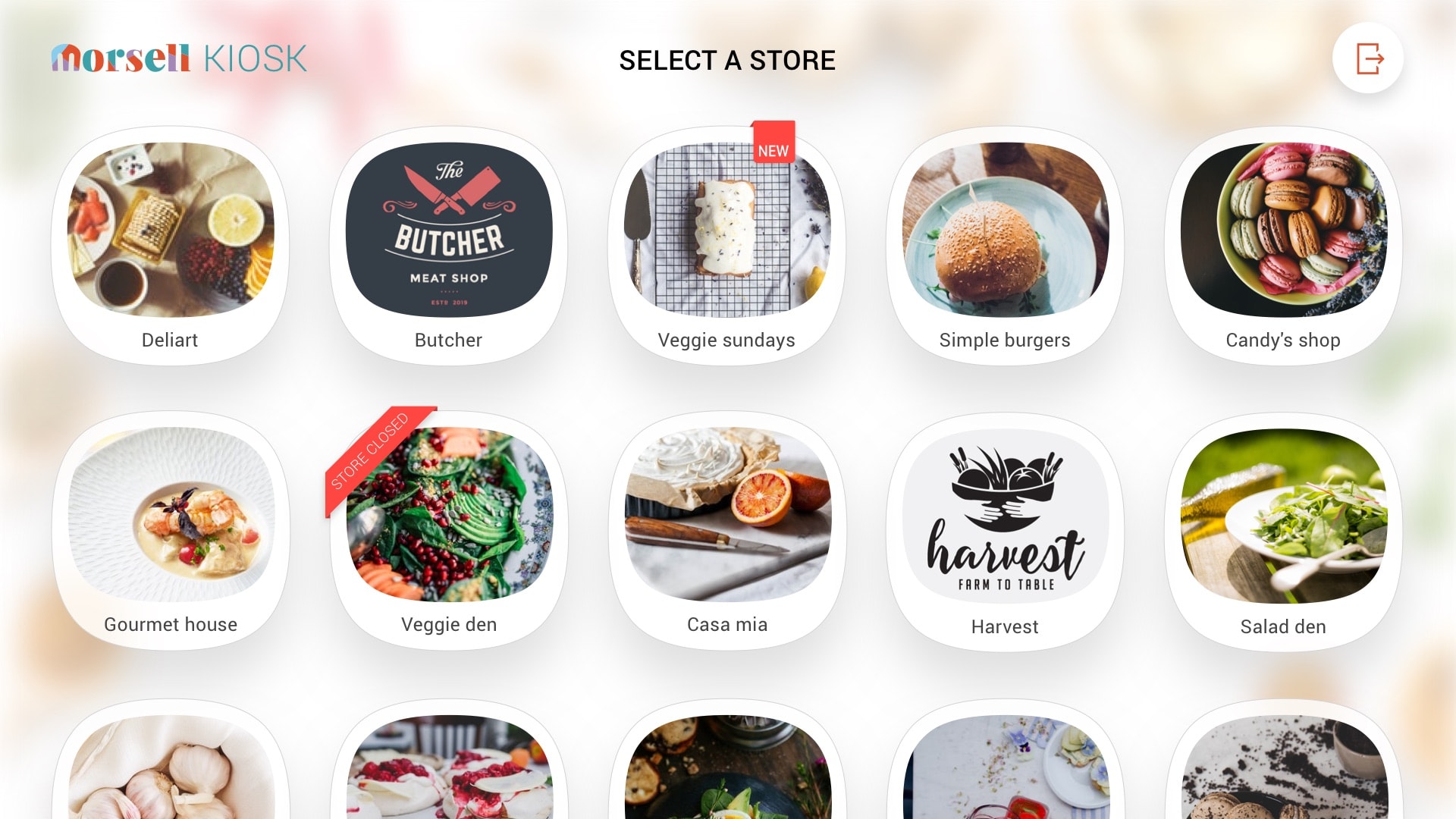
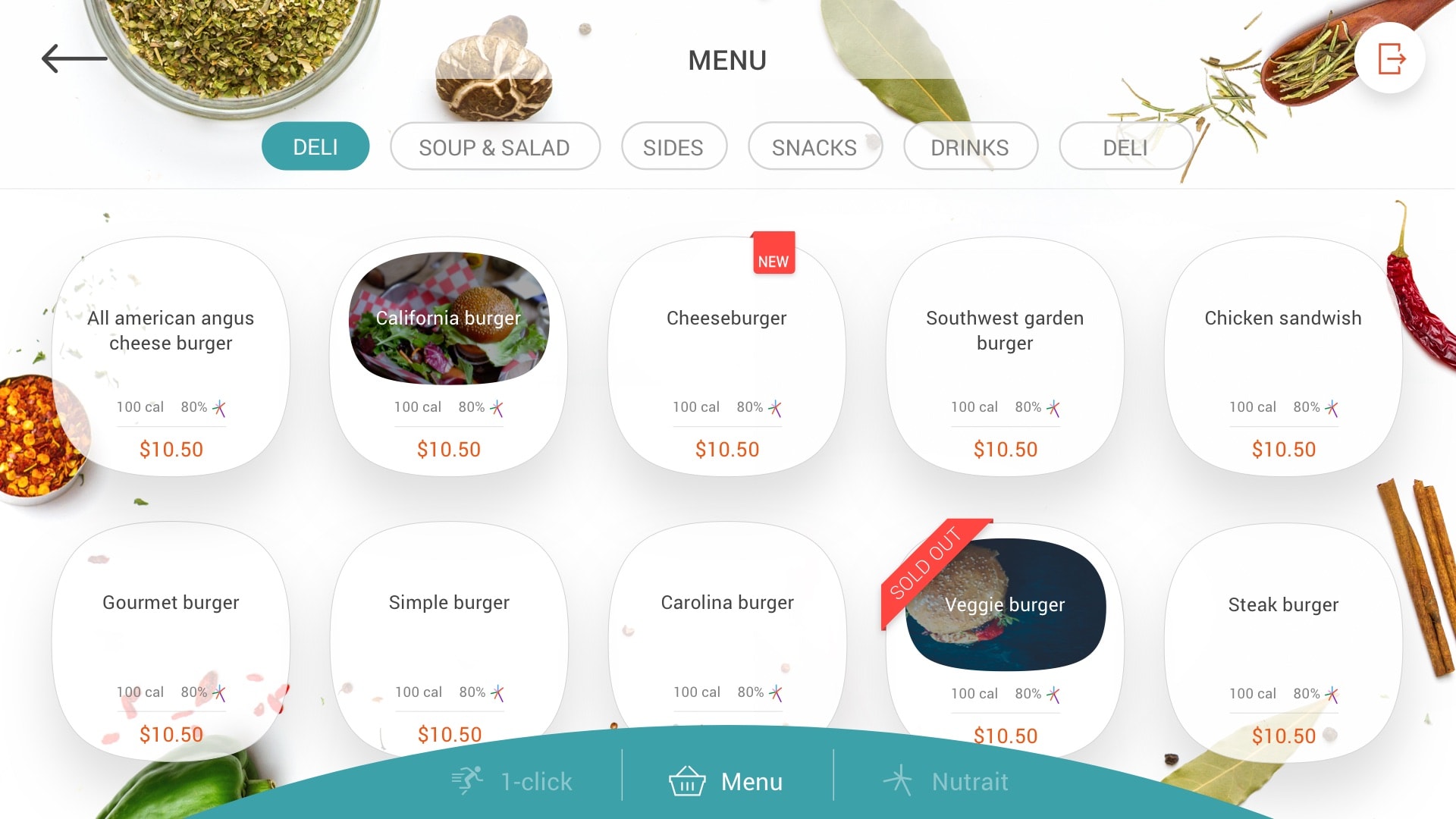
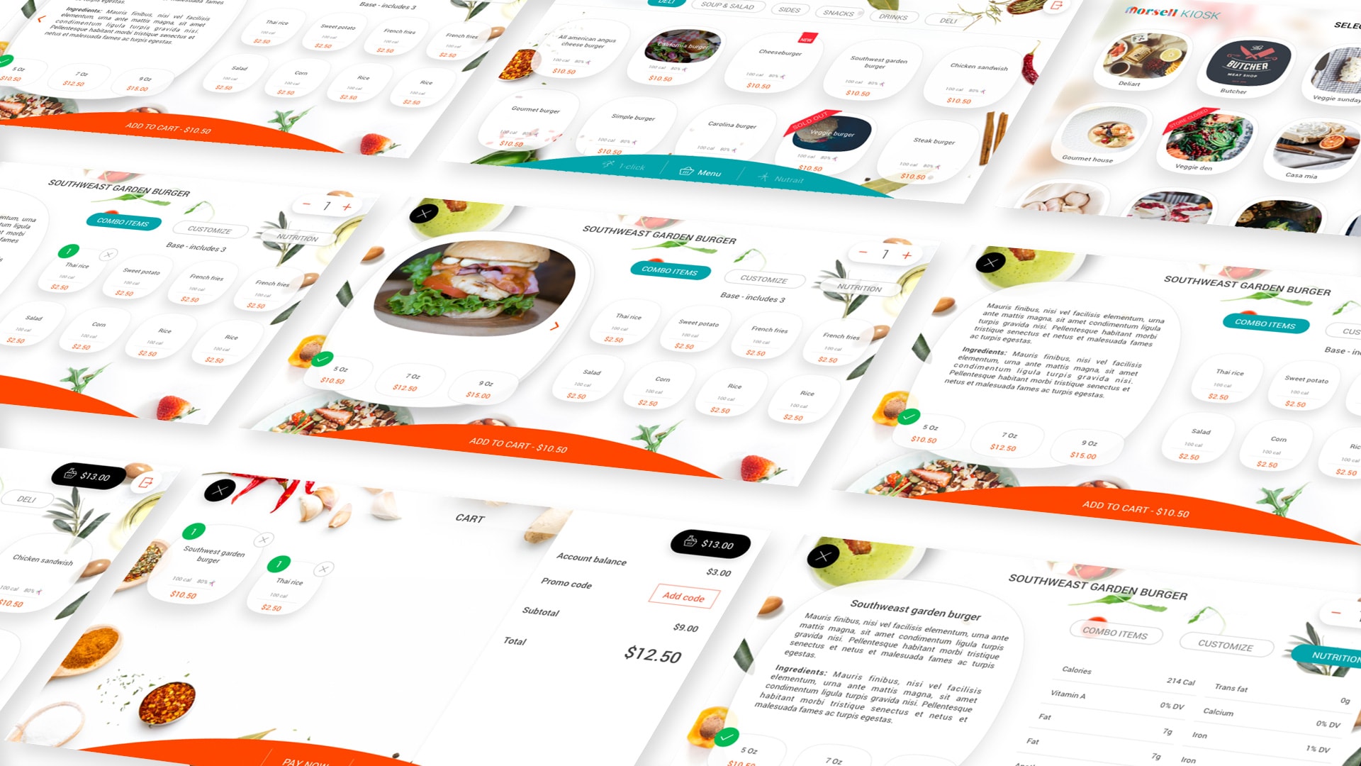
This kiosk will be placed in food courts, catering areas and/or specific restaurants or shops. It will allow people to order the food they want to eat on-site or take-away.
Objective
To improve over version 1 with a more visual, more appealing, highly usable interface.
My contribution
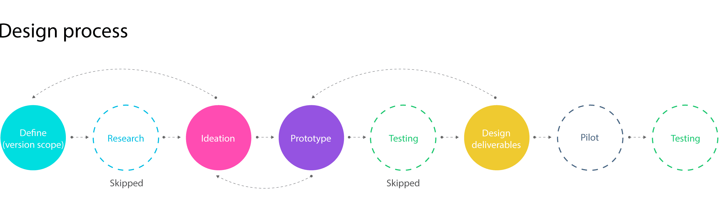
I redesigned the whole set of screens taking into account that in terms of features or number of views we could only accommodate minor changes over version 1. To save costs, the base code should remain the same with minor improvements for usability.