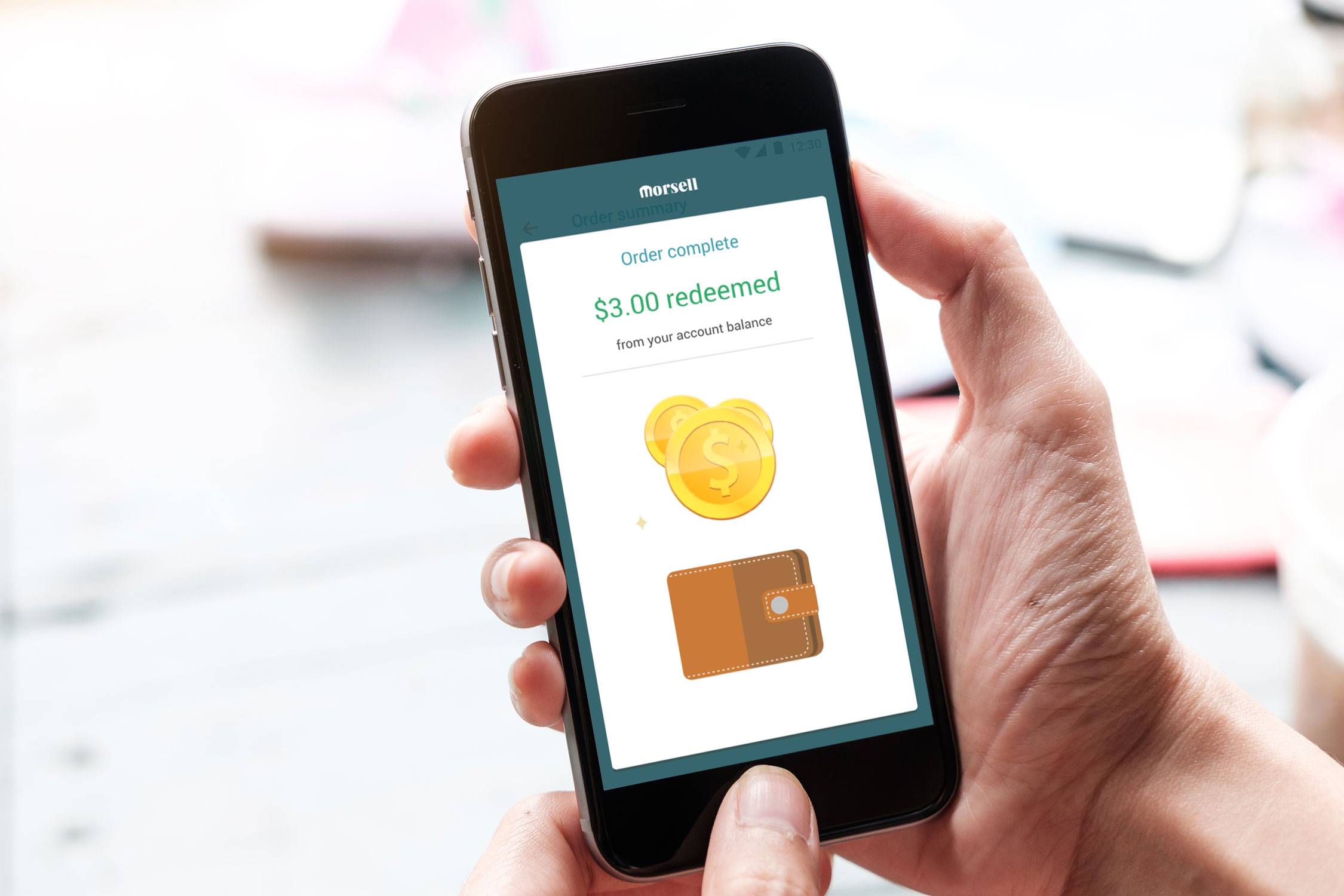
Animation plays a key role in communication and creates an enticing user experience for the customer. In this small project two simple animations were created to communicate what was happening in terms of money added and money retrieved from the customer account balance after payment is complete.
The animations were created in Adobe After Effects and coded into JSON using the Body Movin extension for After effects, created by airbnb and shared via GitHub.
My contribution for this project
In Morsell application, after completing some purchases, the user gets credited a certain amount in his account balance. This projects aimd to improve the experience of what happens when that kind of transaction happens, making it informative to the user that he is getting benefits on using the app.
After the purchase is completed, the users were not being properly informed what happened in their account balance in terms of credited cash or used credit to complete the purchase.
The aim was to better inform the user that he was using remaining account balance or collecting account balance on a transaction, so our hypothesis was that “Animations will increase user information about the transaction details in terms of account balance”.

Talking with users was how we understood that they were not knowing that sometimes they were getting money credited on some purchases. This close process with customers continued in an informal way and we got to a point where we could start defining the next steps.
We were unsure about using a static image or going further with animation. Animation would be more time consuming, so it required validation.
I performed twelve A/B tests with some apps users showing them an image (option A) for 2.000 msec. Literature (Eng, H. Y., Chen, D., & Jiang, Y. , 2005) suggests that 3.000msec is moderately long to show an image for memory retention, so this time was lowered to 2.000msec. After showing “option A”, I asked two questions: “What was the information? You earned money or spent money?”. 67% of the test subjects were unsure, 12% said they earned money and 21% said they spent money. Then I showed “option B”, and 98% of the users answered they earned money.
After these results we decided to move forward with animation, so I moved to ideation.

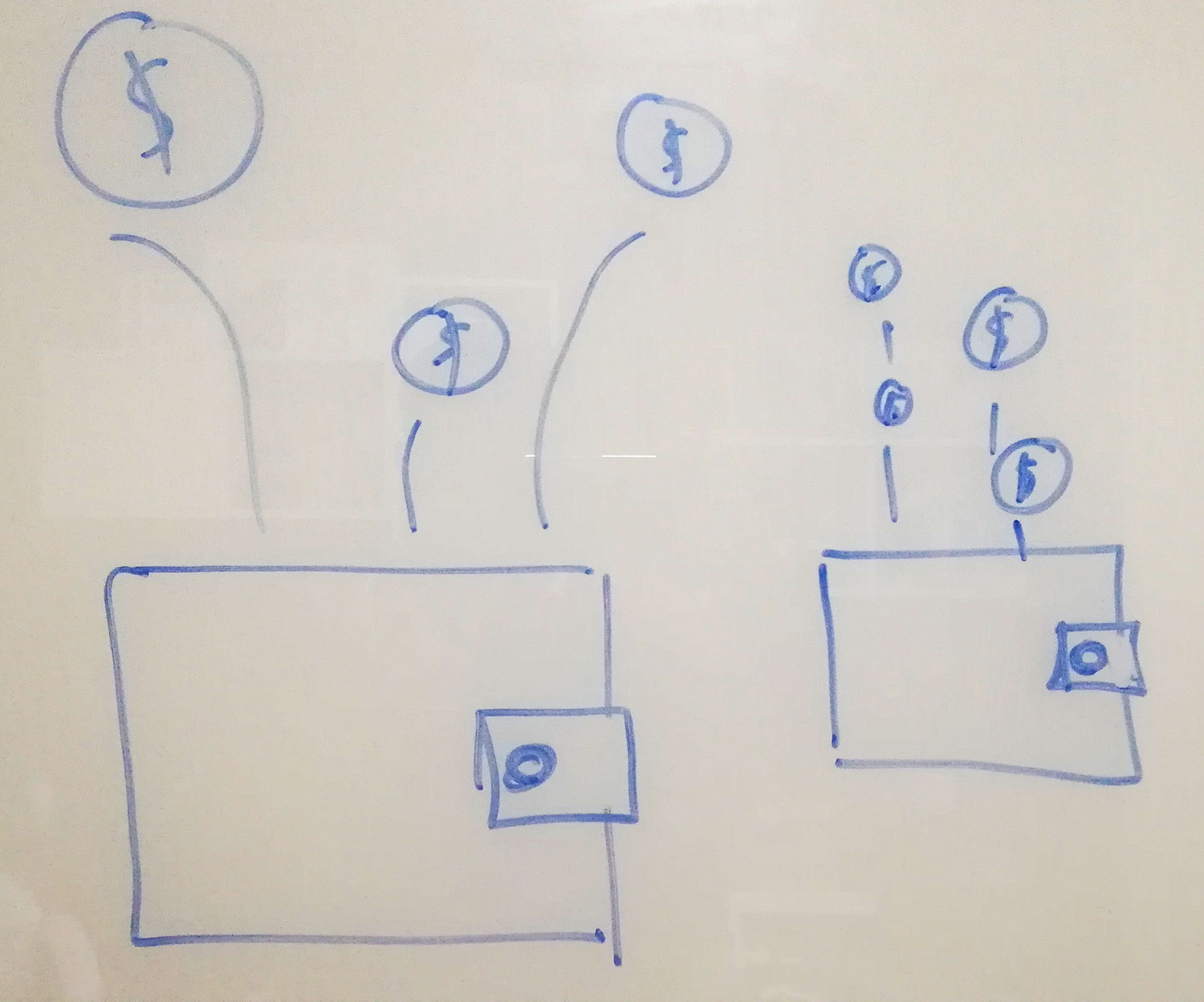
Based on empathy phase interviews, I was aiming for something that could make a clear connection with a wallet and money coming in our going out. Sound was also an important element to add.
I created the prototype using Adobe after effects. For visual performance it was all created in Illustrator using vectors and then converted to After effects vector shapes to avoid conversion to bitmap after exporting with the Body movin extension. A demo HTML was exported so that the prototype could be accessible via browser.
To see the final result, please play the videos bellow.